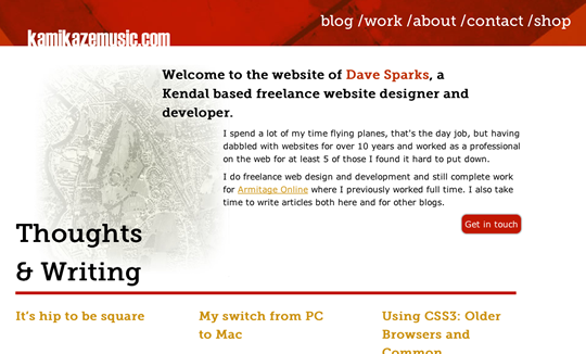
If you’ve made your way to the site since last night you’ll have seen the new look (a picture of the old one is above if you can’t remember it). I’m not sure if it would be classed as a redesign or realign, but it’s the biggest overhaul I’ve done in a while. I had a few new things I wanted to try out and I had some ideas that had sat around for ages, plus the site was seeming a little sluggish so I got stuck into it and decided to get it done at the weekend.
Redesign
It’s not a huge departure from the old design and layout, but then most blogs are pretty much a standard layout the world over. The initial ideas came from a CV I’d done a few months ago (you can see a screen shot on dribbble) which I was really pleased with. It made use of Franklin Gothic and when Typekit announced that Franklin Gothic was going to be offered by their service I decided to start working on a site design along the lines of the CV design.
The major changes include the obvious draining of colour, but I don’t think the site looks too dull for it, the removal of the splash homepage and the blog page in it’s place. Also the custom portfolio pages are gone in favour of a standard design – I found they were giving me an easy excuse to not bother adding anything to the portfolio.
There’s a change in fonts from Museo Slab and FF Meta Web pro to Franklin Gothic and Liberation Sans with a bigger base size of 16px.
New install
Given that the site was feeling a little slow and my WordPress install was littered with god knows what I decided to set up a fresh install of the latest version of WordPress and reassessing all the plugins I used. I also for the first time, made use of WordPress custom post types – notably for the portfolio. Given the rave reviews that were given to it on Boagworld I decided to use the Toolbox theme as a base for the new design. It’s a nicely coded semantic HTML5 starting point.
I also for the first time in a while developed locally on my machine inviting xampp to the redesign party.
Responsive
Having read Ethan Marcotte’s great book Responsive Web Design I was keen to explore the responsive techniques a bit more, I have used it before but I really wanted to have a good go at working with it in mind from the very start of the build.
LESS + GS
I was also keen to try out one the fancy new CSS compilers and having read about The Semantic Grid System on Smashing Magazine I decided to use LESS with The Semantic Grid System, a decision that was made even better after my attention was brought to the LESS app for Mac.
By using the LESS app and a local development environment I noticed pretty much no difference from coding in a normal stylesheet in terms of work flow. The LESS app does offer the great facility to minify your css, be aware though this removes comments which you may need for you theme files, well to show the details at least anyway.
Media Queries
The site is built on the mobile up (or 320 and up) principle, that everything is set up for a mobile site and additional layout rules added as the screen gets wider. Having used a fluid grid, with a max-width set, I currently have only one media query at 800px that controls all the changes needed.
Patent Images
The site initially was a lot more minimal and I had toyed with ideas of adding a texture or some kind of motif when I was reminded of an idea we explored a long time ago with a client at Armitage Online for using images from patents. I’m a big fan of the kind of technical drawing you get in patents, and once published patents are free from copyright and with a bit of research this applies to the images, unless it is explicitly stated that there is a copyright for the images.
I like some of the images but I may remove a few in future if I find it interferes too much with the content, the idea is that they are mostly in the background as a texture to add interest rather than an obvious attention grabbing image.
If you’re after patents Google has a great searchable patents archive with all sorts of crazy stuff in, such as the Readily portable burrito, just keep refreshing the home page and see what pops up.
Still a few bits to tie up
There are still a few loose ends to tie up on the site, I need to have a look at some of the media queries and link colours, as well as proper cross browser testing check – I’ve only done some cursory checks so far (sorry IE users). I’m also considering a new domain name, but I’ve used this for such a long time I’m not sure, even though it is a bit nonsensical.
More posting
I have added a message to any posts over a year old, to make sure people notice and don’t read it like it is cutting edge advice, after all some things in the web world move quickly and some advice techniques stick around for years.
Which means that to make sure everything on the blog isn’t slapped with “this is old” messages I’ll have to add more posts, which I fully intend to do. Having maintained a weekly blog on Love Rugby League I want to try and do that on here – we’ll see how that goes!.
In the meantime though enjoy the site and please offer your feedback, good or bad, in the comments.