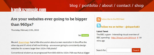
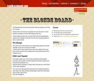
As you may have noticed about a week ago I gave the blog a spring clean and changed to a new theme I’ve been working on for a little while. I’ve felt for a while that the old site was rushed out a little back in October when I wasn’t 100% sure what was going to be the main focus on here and only a few months down the line I wanted a refresh for various reasons.
Using the great WordPress theme test drive plugin I worked away in the background with the site live putting together my new theme.
So what’s changed?
The Layout
I’ve shifted the main blog column over to the left for, well no real reason I just did. I’ve also tidied the pages up in areas I thought it was looking a little messy, the blog post footer for example and I’ve added an accordion on to the pingback section so these are hidden by default and people don’t have to scroll through them to get to the comment form.
The addition of a border on the comments hopefully indicates comment replies quite well and I’ve kept the grey background on admin comments.
Fonts
I’ve been really pleased with using TypeKit so far so I quickly got to work with it and changed a few fonts, the headings over most of the site are now in the great Museo Slab, a popular font which I’m sure will be popping up all over the place soon enough. I’ve also been quite cautious about the use of @fontface for body text but I had a little play around and decided to use it opting for FF meta web pro.
Links
I also changed the link styling, it’s something I often struggle with trying to decide how far to go away from standard text underline styling but I’m happen with the effect of a background and changed colour text which also uses -webkit-transitions for browser that support them.
The change to a solid background is becoming starting to get quite widespread usage and I spent a while fiddling with the hover states on here. Once I was happy with them I took a step back and realised they are quite similar to the mouse over effects on Sam Brown’s site and I hope he sees it as creative inspiration on his part more than anything else!
Portfolio
The main reason for changing the header and footer to their new top and bottom strip styles was to accommodate some changes with my portfolio. I do like the idea of having a bit of variety in posts etc on a blog but I often post small thoughts and snippets that wouldn’t get done if I had to style then up everytime. However I saw my portfolio as an opportunity to inject a bit of the projects style onto the page. I’m hoping that as time goes on I can have a bit more fun with the elements of a project when it comes to adding them to the portfolio.
Things still to do
The code has mostly been changed over to HTML5 however there are a few bits still outstanding and in need of change so they need to be looked at. There are also a few little details to take care of and the footer still looks rubbish, just a collection of lists so I need to get around to sorting that out. The tweetme button needs to be added to some pages but that will be done via the manual code and the main portfolio overview page also needs changing, but no doubt once I get around to doing all that I’ll be all ready for a brand new look all together!

